Projects
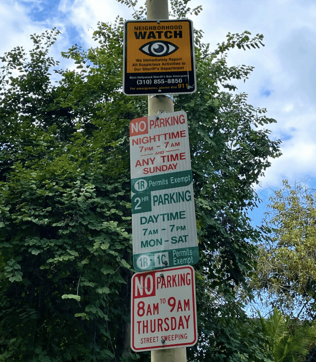
The bustling area of Melrose & Fairfax in Los Angeles presented a significant challenge with parking due to the existing signs causing misinterpretation and avoidance. The "SimpleSign" project aimed to transform this experience into a user-centered one, eliminating common parking anxieties.
UX Researcher & Strategist: Conducted user research, gathered insights, and defined the UX strategy to address user needs.
Interaction Designer & Prototyping Lead: Designed intuitive parking signage and developed interactive prototypes using NFC tap and QR code technologies.
Usability Tester: Led usability tests and iterated designs based on user feedback to ensure accessibility and clarity.

🚫🅿️ Challenge
Visitors to the Melrose & Fairfax area struggled to interpret and trust the existing parking signage. This led to unnecessary stress and potential parking violations.

💡 Insight
Feedback and interviews, particularly from Kai & Amir and Monica & Kayla, highlighted the demand for a more intuitive, globally-informed, and accessible parking sign system. The use of technology was identified as a means to enhance user trust and understanding.
🔨 Process
Began the design process by creating physical prototypes from cardboard. This allowed us to quickly experiment with different shapes, sizes, and layouts for the parking signs, providing a tangible sense of how they might look and feel in the real world.

Wireframes
Transitioned from physical prototypes to digital wireframes, focusing on the layout and functionality of the signs. This step involved detailed digital sketches that outlined the placement of symbols, color coding, NFC and QR code integrations, and text.

Storyboard/Journey Map
Developed a storyboard or journey map to visualize the user's experience from discovering a parking spot to confidently parking their vehicle. This helped in understanding the user’s interactions with the sign at every step, ensuring a seamless and stress-free parking process.

Competitive Analysis
Conducted a thorough competitive analysis to understand how existing parking signs and systems function in similar urban environments. This research included studying the effectiveness, user feedback, and design elements of current solutions to identify gaps and opportunities for improvement in our own design.

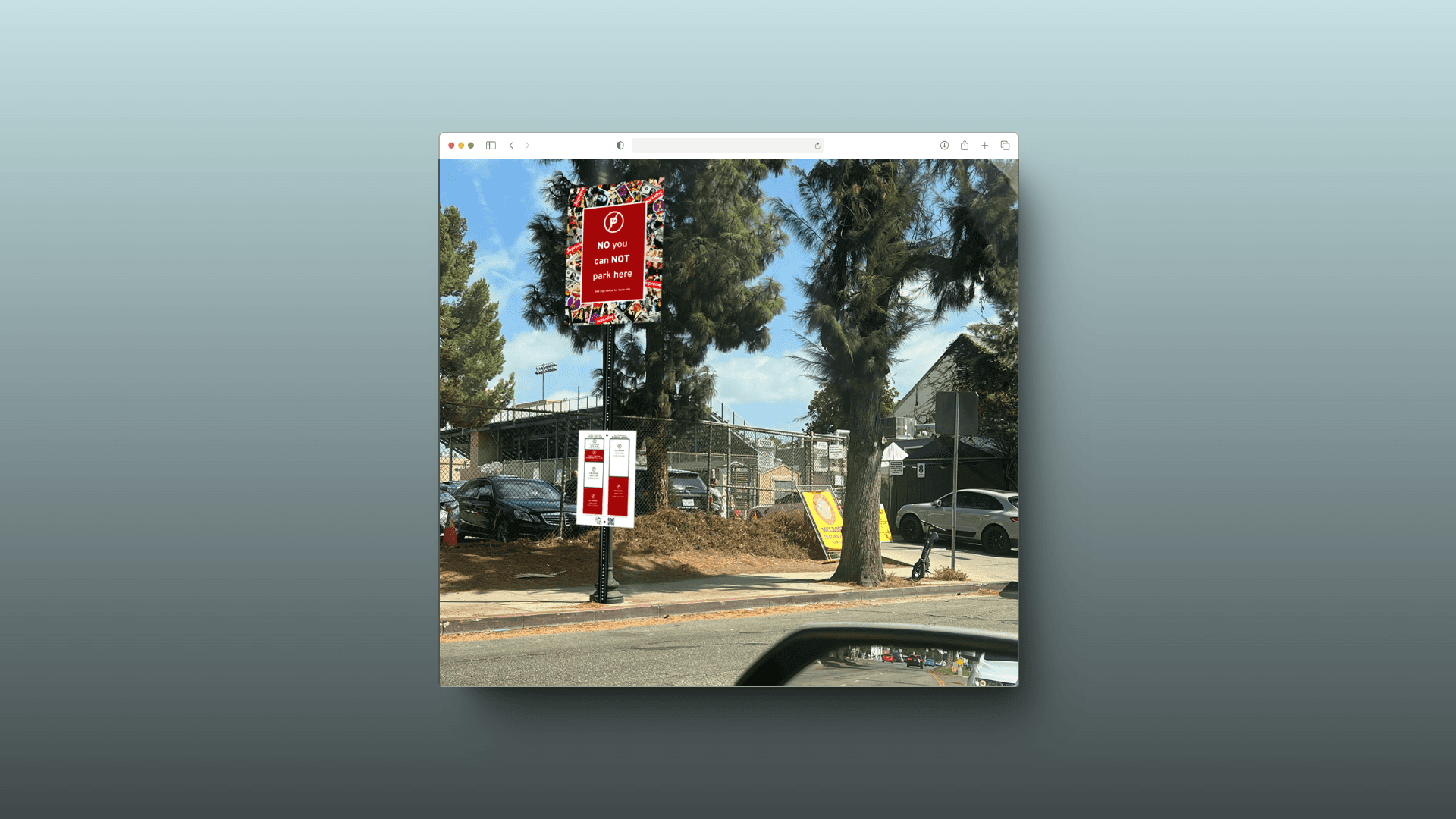
✅ Solution
"SimpleSign" is the result of combining extensive research with modern design principles. By utilizing globally recognized symbols, intuitive color coding, and incorporating NFC tap and QR code technologies, the design offers an easy overview of weekly parking dynamics, making it more accessible and understandable.
📘 Lessons Learned & Future Considerations
Throughout the "SimpleSign" project, we gained valuable insights into the challenges of simplifying complex systems like parking signage. A key lesson was the importance of user-centered design in creating solutions that not only address pain points but also enhance trust and usability through intuitive design and technology.
Looking ahead, future iterations of the system could incorporate real-time parking availability data and expand to other neighborhoods. Continuous user testing and feedback would ensure the system remains adaptable and effective, meeting evolving user needs and technological advancements.